Timon Dhaeze Coaching
Rebranding of a coaching business: a new logo icon, a design system that feeds the site, video, carousels and print, plus a website in three languages.
The question
The old cartoon style with thick outlines did not suit an audience used to investing in themselves. Everything had to become one brand, from the site to every post.
What we built
- 01
A new logo icon
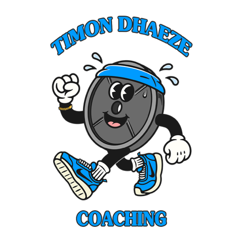
A figure with a weight plate, redrawn as a vector in eight colour layers, with exports for every place that cannot handle a vector.
- 02
One source for the entire style
Colours, typefaces, sizes, shapes, the grain texture and the logo sit in one file. The brand's website, videos, carousels, presentations and print all read from it. One change and everything follows.
- 03
A website in three languages
Dutch, French and English, with an online health check, an offer page, a booking calendar and a blog.
- 04
Content that lays itself out
Templates for carousels, covers and subtitled reels, so a text becomes a finished post in one step.
- 05
A custom link page
A replacement for a link-in-bio service, with a test of three layout variants against each other.
- 06
Documents in the same style
Meal plans, shopping lists and worksheets as PDFs, all from the same system.
What it delivers
Every touchpoint, from reel to invoice, is instantly recognisable. Rolling out a new style takes a single file.
Lead agency: het designbureau. Het designbureau also worked on this project.